
Identity of a broadcaster
Just as we humans are unique, so too are the channels we curate and watch. That unique identity is evident in every aspect of the channel—from the website, flyers, and social media presence to the on-air experience itself. Colors, shapes, motion, and music engage the viewer, shaping their overall experience of the channel. Yet, creating that experience is not the only challenge; technically optimizing the content for automated playout systems can be equally demanding. The result, however, is a highly interactive visual style that evolves alongside the content, seamlessly weaving the channel’s identity into the mix.
The brief was to create a package of bumpers showcasing, among other things, the various sports broadcast by SportTotal. The channel’s bold, sleek logo called for an equally bold visual identity. I employed a contemporary, gritty rock music package and fast-paced, trendy edits featuring a variety of sports, enhanced with raw overlays and clean motion graphics. For the sport-specific bumpers, I sourced and created 3D models tailored to each sport—acting as clearly recognizable icons. I applied a rugged texture to the models and rendered them photorealistically in Cinema 4D. The result is a raw, modern, and uptempo style that invites every sports fan to enjoy watching these dedicated athletes.
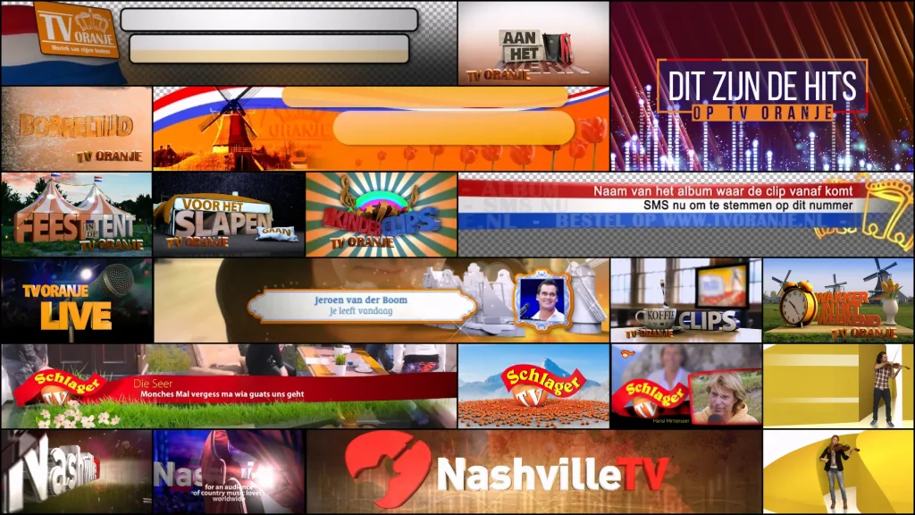
This is a music channel dedicated entirely to country music. Beyond the familiar sounds of the steel guitar, fiddle, and stomping boots, the music featured is incredibly diverse. The channel’s logo is a guitar pick with a guitar shape cut out of it. I used this shape in Adobe software to test out a 3D rendering engine that was brand new at the time. This allowed me to add depth to the logo and rotate it in any direction—for instance, for overlay bumpers automatically triggered by the Playbox playout system. The glass effect gave the logo a sleek, modern on-air look. Combined with classic country imagery and a background featuring a more ‘vintage’ aesthetic and color palette, this reflects the vast scope of Nashville TV.
Who isn’t familiar with the Top 40? It is the Netherlands’ definitive chart, still updated on a weekly basis. A dedicated channel was launched to broadcast music videos from this chart—spanning both past and present—all day long. This required a comprehensive on-air branding package, naturally centered around the iconic logo and its signature color scheme. I used the logo’s slightly skewed squares as a foundational element to display the 40 tracks and to feature in the channel’s bumpers. Elements such as speakers and spotlights—rendered in a style that blends modern aesthetics with a 90s vibe—evoke the chart’s long and storied history.
This project was set to run on yet another new playout system: VIPE by BCNexxt. There were several requirements regarding automation. These included displaying various additional data in the title bar—such as current and previous chart positions, or markers like a “dot” or “alarm disc” indicator—as well as overlay bumpers appearing over the clip to make these markers stand out. There was also a logo bug designed with space to display the current program. I crafted the bumpers so that the song-specific ones always align perfectly, creating a seamless, continuous motion—reflecting the fact that the Top 40 chart is constantly in flux.
TV Oranje is the premier channel for Dutch music. Alongside the biggest Dutch hits, the channel aims to be highly accessible by providing a platform for music videos from up-and-coming artists. A comprehensive visual identity package was created for the channel, with Dutch identity playing a central role. This is reflected not only through typically Dutch elements but also by incorporating the Dutch seasons and holidays into the visual design—creating a look that resonates with every Dutch viewer, making them feel right at home.
Across all design iterations, I consistently sought a modern aesthetic that also honors quintessentially Dutch elements—ranging from a clean white “clay render” style to trendy, animated red-white-blue-and-orange graphic panels incorporating Dutch objects and textures. Over time, the channel significantly overhauled its programming by introducing themes tailored to the time of day. I opted to create distinctive 3D logos for this purpose; these are used in external communications and brought to life on-air through animated thematic bumpers. Almost all the bumpers incorporate Dutch video footage or clips. These can be easily swapped out, allowing the bumpers to be updated periodically—reflecting the timeless appeal of Dutch music.
Identiteit of a church
Identity is about your background, the values and principles you stand for, and your beliefs. It is particularly important for a church to articulate this identity clearly and strongly. The Bethel Independent Baptist Congregation in Drachten aims to be a church that holds fast to biblical teachings while conveying them to the surrounding community in a modern, contemporary way. For many years, I have dedicated myself wholeheartedly to translating the Gospel message in a contemporary and accessible manner. This message lies at the very core of the congregation’s identity and is therefore central to how it presents itself to the outside world.
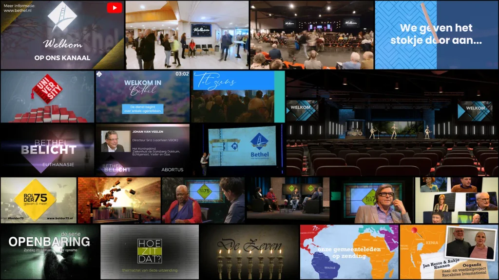
Due to the coronavirus, the Netherlands went into lockdown, and Bethel was no exception. All activities and services had to move online. This presented a great opportunity to re-evaluate the overall visual style of the services. I aimed to create a single overarching format that could be adapted for the congregation’s various groups: children, teens, young adults, and adults. To achieve this, I developed ‘digital sets’ designed to be displayed on a large 8-meter screen behind the speakers. These were digital ‘rooms’ created in Cinema4D, featuring props tailored to the specific target audience and windows capable of displaying changing content. I angled the windows slightly backward so that the perspective created extra depth in the background. I then used these digital sets as the basis for designing the accompanying bumpers and slides—different target groups, yet one united congregation.
Bethel is about more than just Sunday morning services. New members are invited to an introductory evening where this becomes abundantly clear. The heads of the various task groups explain what happens—not only on Sundays but also throughout the week—and, of course, how members can get involved. The idea arose to present this information in a video format. I wrote a script that seamlessly connects the ten stories from the different task group leaders, allowing them to pass the baton to one another in a logical, natural flow. Using Premiere Pro, I prepared each segment individually so that it could also stand alone as a separate video. I then cleverly arranged them sequentially on the master timeline and styled everything according to the church’s new visual identity. This setup makes it easy to update a single segment if necessary, as things frequently change in a congregation of this size.
Mission work is a key pillar of the church’s outward-facing global outreach. I was asked to develop a new visual identity and style for this task group. A central element was a large display board in the church foyer, accompanied by matching banners and badges representing various missionaries stationed around the world. The client wanted to incorporate more color, so I used specific colors to clearly distinguish between the different continents. These colors are consistently reflected throughout the design—for instance, in the logo’s arrows and in the color coding applied to the banners based on where each missionary is active. This approach not only creates a colorful look but also serves a clear functional purpose: it illustrates the global reach of the church’s missionaries.
Bethel was looking for an accessible way to spark conversations about faith. The idea emerged to invite well-known Dutch figures and have these conversations live at the church itself, located at De Bolder 75. The video team practiced producing a talk show format, while I prepared the multimedia support for the program. A logo and visual style had been designed, which I brought to life in a 3D animation: a wall breaking open—symbolizing how a good conversation can lead to a breakthrough and foster openness regarding differences between people. Additionally, I created content for the set screens, build-up photo databases and on-screen titles, and produced promotional videos and highlight reels to showcase this wonderful project in a contemporary way.
Show your identity
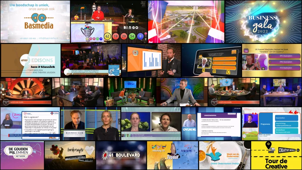
At Basmedia, and later at Stream NL, I had the opportunity to create numerous videos for a wide variety of clients. Almost all of these clients already had a distinct visual style that defined their identity—an identity I consistently incorporated into every video. In addition, for Stream NL’s streaming projects, I created custom interactive content. This included elements such as logo bugs, slides, lower thirds, background loops, and Picture-in-Picture (PiP) overlays that could be triggered live via the TriCaster video switcher used to manage the stream. It was crucial to design this content so that the system displayed it correctly, ensuring the client’s identity remained visible and recognizable throughout the entire broadcast. Below, you will find the Stream NL showreel alongside a preview of Basmedia’s latest showreel. Both demonstrate the vast range of productions I have worked on and clearly showcase the distinct identities of the various clients involved.
The Basmedia showreel below never went live. However, in this concept, I clearly wanted to articulate an identity and an objective that define Basmedia’s approach across all its productions. Once again, the point is not just to show what you create, but also why; ultimately, your identity determines what you do.